Hotham Granite is bold, sophisticated, and full of character. With its charcoal tones, deep mineral veining, and strong natural texture, it’s become a go-to for architects and designers seeking depth and impact in both interior and exterior spaces. But for this stunning stone to truly shine, it needs the right supporting cast.
At Splendour in Stone, we’re often asked: what colours go best with Hotham Granite? In this guide, we break down the best pairings to help you elevate your space with thoughtful contrast, subtle harmony, or bold tone-on-tone styling.
What Makes Hotham Granite Unique?
Hotham Granite is distinguished by its deep grey to charcoal base, punctuated with soft mineral variations—sometimes cool-toned, other times with a hint of warmth depending on light and cut. The stone’s slightly textured surface creates a tactile experience that feels raw yet refined.
It’s incredibly versatile. Whether you’re designing a feature wall, fireplace surround, exterior façade, or alfresco kitchen, Hotham Granite holds its own as a statement piece.
Its depth of colour makes it ideal for creating contrast or anchoring a moody, monochromatic scheme.
Design Principles for Pairing Colours with Natural Stone
Pairing colours with a textured stone like Hotham Granite should feel intentional, not random. Here’s what we recommend:
- Contrast vs harmony: Use lighter tones to highlight the stone’s boldness, or earth-based neutrals to blend with its natural aesthetic.
- Balance the mood: Granite’s deep colour can feel heavy; balance it with lighter flooring, cabinetry, or soft furnishings.
Play with finishes: Matte, brushed, or honed surfaces reflect light differently. Complementing finishes can either soften or emphasise contrast. - Let the stone lead: Hotham Granite should be the hero. Supporting colours should enhance not compete with their richness.
Top Colour Combinations for Hotham Granite

Striking on its own—stunning when paired right. The right colour combinations can unlock the full visual power of Hotham Granite.
1. Warm Neutrals (Beige, Taupe, Soft Browns)
Pairing Hotham Granite with warm neutrals like taupe or soft tan helps balance the stone’s cool undertone and adds a welcoming, earthy feel.
These colours create contrast without being stark and are particularly effective in living areas, outdoor kitchens, or spaces with timber or natural finishes.
Think of linen upholstery, travertine flooring, or warm oak cabinetry alongside the granite, soft, warm, and cohesive.
2. Crisp Whites and Off-Whites
There’s nothing like crisp white to highlight the depth and texture of Hotham Granite. This high-contrast pairing makes the granite pop, especially when used as a feature wall or fireplace backdrop.
Off-whites (like antique white or ivory) are slightly softer for those wanting contrast without clinical sharpness. These combinations work beautifully in minimalist or Scandinavian interiors, offering clarity and visual structure.
3. Dusty Greens and Olive Tones
Nature-inspired hues like sage, olive, and dusty eucalyptus pair beautifully with Hotham Granite. These muted greens echo the natural environment and complement the stone’s mineral tones without overwhelming it.
This combination is ideal for feature walls in bathrooms, garden walls, or internal spaces designed to feel grounded and calm. Add textured timber and aged brass accents for a relaxed, elevated aesthetic.
4. Charcoal on Charcoal (Tone-on-Tone Sophistication)
Double down on the drama with a tone-on-tone charcoal scheme for a bold, moody look. Pairing Hotham Granite with similar dark tones, like deep graphite, smoky grey, or even matte black, creates a layered, sculptural effect.
It’s ideal for modern architectural builds, commercial entryways, or minimalist bathrooms where texture does the talking. Just layer in ambient lighting or metallic accents to avoid the space feeling too flat.
5. Metallic Accents (Copper, Aged Brass, Matte Black)
Metallic tones bring out the natural flecks and movement in Hotham Granite. Warm metals like copper or aged brass create a luxurious contrast, while matte black finishes enhance the stone’s clean lines and modern feel.
Use these colours sparingly—in tapware, lighting, trims, or custom hardware, to elevate the design without overpowering the natural texture of the stone.
Spaces Where These Combinations Work Best

Pairing the right colours with Hotham Granite is only half the story, knowing where to apply them truly completes the picture. These spaces bring out the stone’s natural beauty while allowing your chosen colour palette to shine.
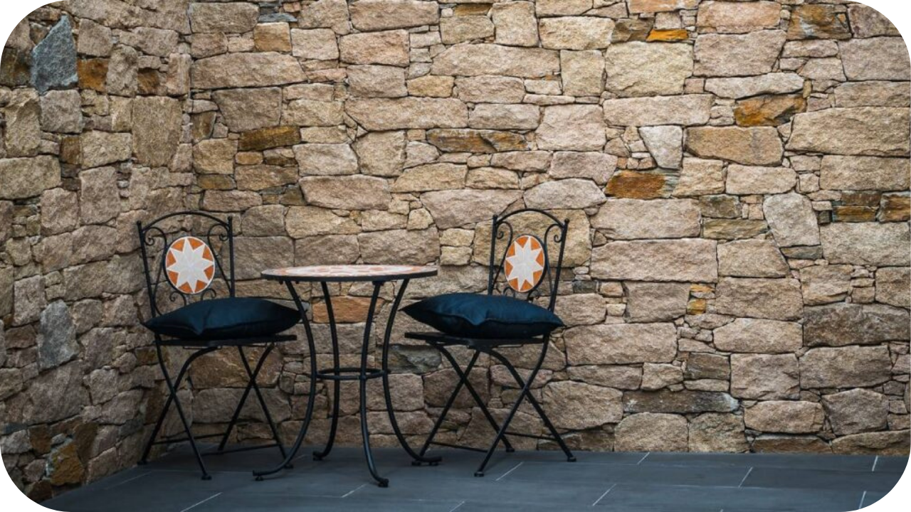
1. Entryways
First impressions count, and Hotham Granite creates a bold, architectural welcome in an entryway. It instantly sets the tone, whether installed as cladding on an exterior wall or a striking panel inside the foyer.
Pair it with warm lighting, brushed metal finishes, and timber door details to soften the granite’s intensity. Use crisp whites and charcoal detailing to highlight the stone’s depth for a sleek, minimal approach.
Entryways benefit from materials that are not only visually impactful but also durable and Hotham Granite does both with ease.
2. Outdoor Entertaining Areas
In alfresco zones, patios, and pool surrounds, Hotham Granite works beautifully as a feature wall or built-in bench surround. Its rich, dark tones create a sophisticated backdrop that contrasts beautifully with greenery, timber decking, and soft-toned pavers.
It brings warmth and cohesion to outdoor spaces when paired with earthy tones like olive green, beige, and copper. Add ambient lighting to emphasise its texture at night, or complement it with matte black fittings for a more modern, urban look.
It’s weather-resistant and low-maintenance, making it perfect for Australian outdoor living.
3. Fireplaces and Internal Feature Walls
Few materials create a focal point like Hotham Granite around a fireplace or as a statement wall. Its textured surface adds movement and depth, especially when illuminated by soft lighting.
In living rooms or lounge areas, it pairs well with warm neutrals, woollen textiles, and brass fixtures for a balanced, inviting atmosphere. Alternatively, frame it with white walls and black metal accents for a more contemporary edge.
These colour combinations help draw attention to the granite’s surface detail without overwhelming the room—perfect for interiors that need both texture and restraint.
4.Commercial Lobbies and Façades
Hotham Granite offers sophistication and structure in commercial environments, ideal for lobbies, reception areas, and building façades. Its dark, layered appearance projects professionalism and permanence.
Pair it with polished concrete floors, matte black signage, and tone-on-tone greys for a bold, industrial look, or introduce metallic finishes like aged brass or brushed nickel to add warmth and elegance.
Lighting plays a critical role in these spaces; wash lighting or spotlights can bring out the stone’s depth and create visual interest across large vertical surfaces. The right colour palette ensures the stone enhances brand identity while elevating the space architecturally.
Splendour in Stone’s Design Advice

At Splendour in Stone, we don’t just supply stone, we help clients visualise the complete picture. When working with Hotham Granite, we encourage you to start with the stone as the anchor and build your palette around its unique grain, movement, and finish.
We offer guidance on tonal pairings, finish selections, and layout concepts that ensure your granite doesn’t just sit in the space—it leads it. With access to samples, mood boards, and expert advice, you’ll find a colour scheme that works as beautifully in real life as it does in your vision.
Conclusion
Hotham Granite is a powerful design element—and when paired with the right colours, it can completely transform a space. Whether you’re after contrast, warmth, or a moody, sculptural finish, the combinations above give you the flexibility to make it your own.
Ready to find your perfect match? Get in touch with Splendour in Stone for samples, tailored design advice, or to bring your next project to life with confidence.
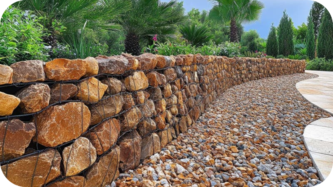
8 Advantages of Using Stone Grid Gabions in Your Landscape
Are you seeking a durable, cost-effective solution to elevate your landscape? Stone grid gabions might be the perfect choice! These versatile, eco-friendly structures offer a
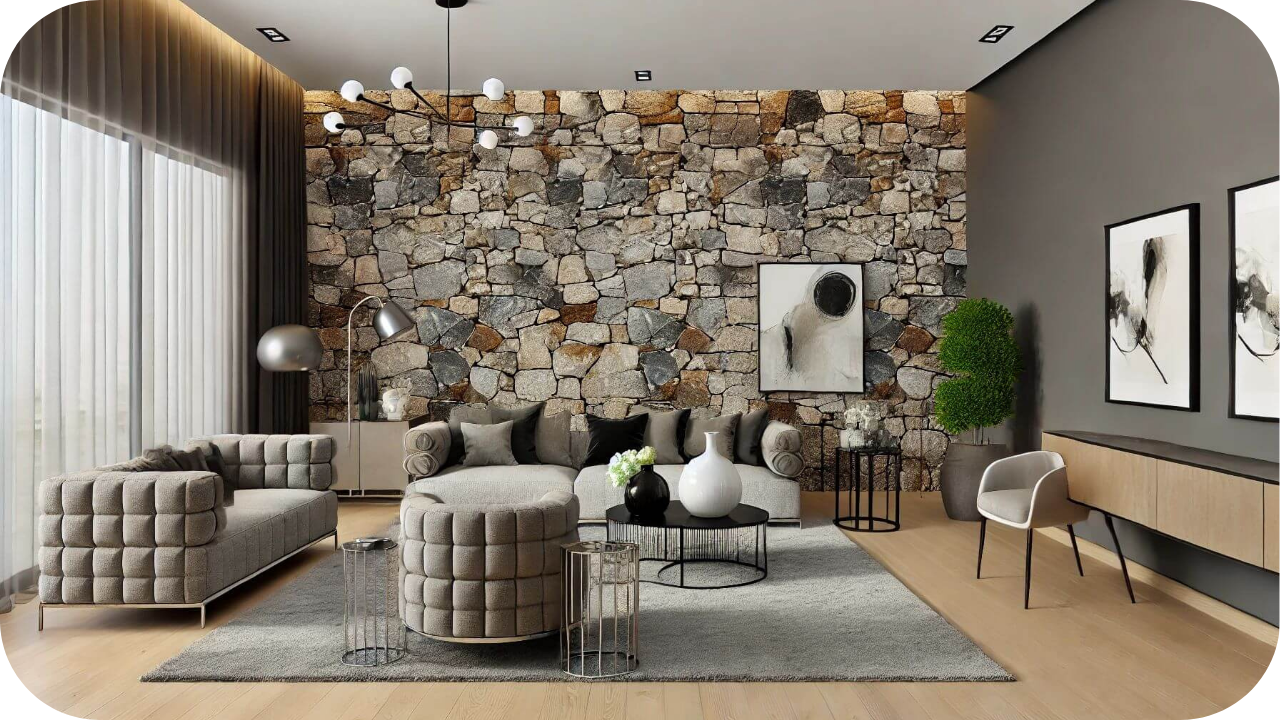
10 Stunning Feature Wall Ideas Using Natural Stone
Looking to elevate your home with a stunning feature wall? Natural stone offers a timeless, elegant touch that can transform any room. From sleek marble
