Stone colour does more than beautify, it influences perception, mood, and memory from the moment a customer steps inside.
In boutique stores and cafés, where atmosphere shapes experience, the colour of your stone cladding plays a powerful role in how your brand is seen and felt. Colour consistency across walls, signage, and materials reinforces brand recognition and creates a cohesive story.
Whether your style is warm and welcoming or cool and contemporary, this guide will help you choose the best stone colours to reflect your brand’s identity and leave a lasting impression.
Colour Psychology in Branding
Colour isn’t just visual, it’s emotional. In retail and hospitality environments, your chosen colours can subtly influence how customers feel, behave, and even spend. Warm tones like honey and terracotta can create a sense of comfort and trust, while cooler shades like grey or charcoal project modernity, calm, and professionalism.
When applied through stone cladding, these colours become a permanent part of your brand’s physical identity. A well-chosen stone tone can align with your logo, packaging, and interior palette, reinforcing brand consistency across every touchpoint. The goal is simple: make your space feel unmistakably “you” while evoking the right emotional response.
Whether you want to feel organic and grounded or sleek and high-end, understanding colour psychology gives you the power to craft environments that connect on a deeper level with your audience.
Best Stone Colours by Brand Personality
Every brand tells a story—your stone colour should echo that voice. Here’s how to choose tones that speak your language:
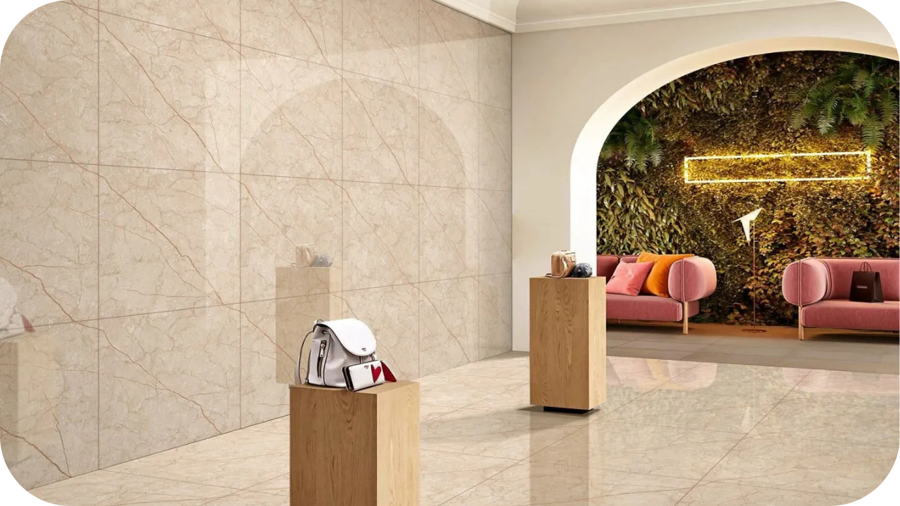
1. Neutral Tones (White, Beige, Cream)
These colours are ideal for brands that value simplicity, elegance, or wellness. White, beige, and cream stone cladding creates a serene backdrop that doesn’t compete with products or signage, making it perfect for high-end boutiques, natural skincare brands, or artisan cafés.
These tones amplify light, open up small spaces, and blend effortlessly with timber, glass, and soft lighting. They project trust, cleanliness, and minimalism, essential qualities for brands focused on purity, craftsmanship, or refined customer experiences.
Whether honed limestone or light sandstone, neutrals offer timeless appeal that speaks subtly yet strongly.
2. Warm Tones (Terracotta, Honey, Ochre)
Warm stone colours like terracotta, honey, and ochre connect with nature and evoke a grounded, welcoming feel. These tones are perfect for brands with a rustic, handmade, or family-friendly image think organic grocers, vintage boutiques, or casual cafés.
Their richness adds depth to façades and interiors while complementing timber and greenery beautifully. Warm tones encourage comfort and longer stays, making them ideal for cosy settings.
Natural sandstone or tumbled quartzite in these shades enhances a space’s tactile quality, giving your brand a relaxed but memorable presence.
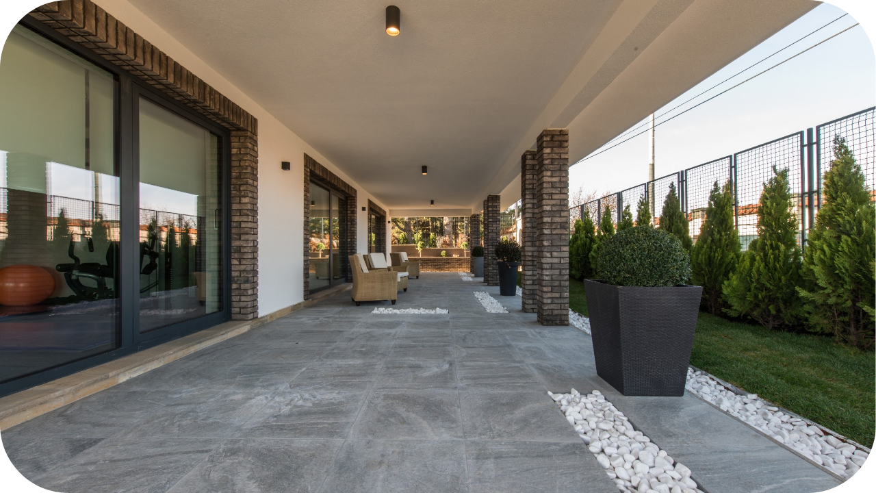
3. Cool Tones (Grey, Charcoal, Bluestone)
Stone cladding in shades of grey, charcoal, or deep blue-grey (like bluestone) brings a contemporary, confident aesthetic to retail or hospitality spaces.
These tones suit fashion-forward boutiques, tech-inspired stores, or urban cafés looking to project sophistication and structure. Cool colours evoke calm and neutrality, providing a grounded base for bold signage, greenery, or polished fixtures.
Pairing cool-toned stone with concrete, steel, or matte black accents sharpens your visual identity while keeping the space effortlessly sleek.
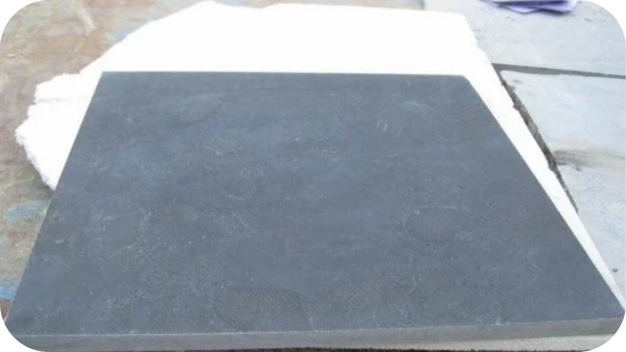
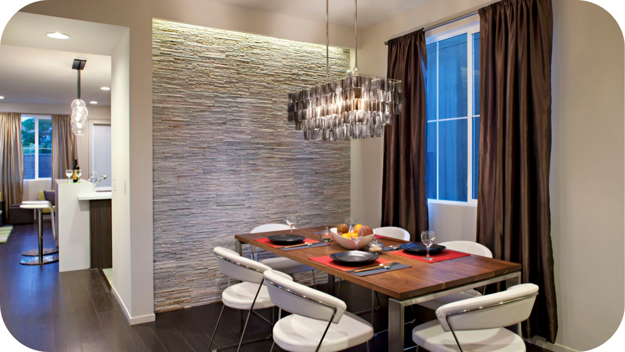
4. Dark Tones (Black, Deep Brown, Slate)
Black slate, deep brown granite, or charcoal marble instantly adds weight and exclusivity to your branding. These colours are ideal for high-end fashion, luxury hair salons, exclusive cocktail bars, or boutique consultancies that want to command attention.
Used on façades, feature walls, or counters, dark stone creates contrast and atmosphere, especially when paired with brass fittings, moody lighting, or timber shelving.
It’s the colour family for brands that embrace elegance, mystery, and high-impact visual design.
5. Accent Colours (Blush, Green, Gold Flecks)
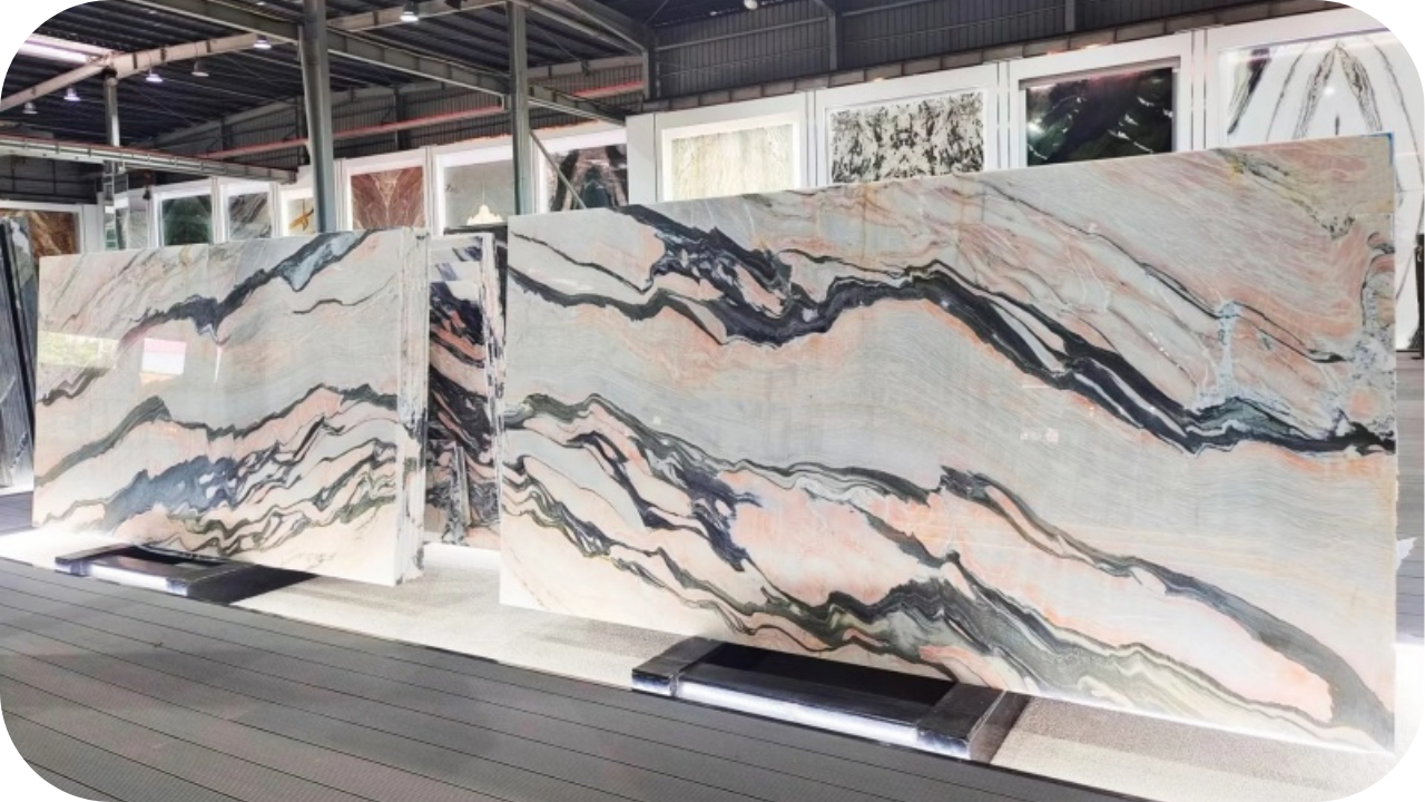
While most brands stick to safe palettes, those who embrace soft blushes, muted greens, or gold-veined stones stand out. These accents introduce uniqueness without overwhelming your brand message.
Perfect for florists, dessert cafés, boutique salons, or creative agencies, these colours add just enough surprise to make your interior memorable. Use them sparingly as feature wall inserts, front counters, or behind shelving, so they enhance rather than distract.
Blush marble, green quartzite, or gold-flecked limestone adds texture, emotion, and originality to branded spaces.
How to Match Stone Colour with Your Branding Elements
Consistency is key in strong branding, and your stone colour should be no exception. Matching your cladding to your brand elements helps create a seamless, recognisable environment that reinforces identity from the outside in.
Start with your logo and brand palette. Opt for sandstone or ochre-coloured stones if your branding uses warm, earthy tones. For cool-toned logos, greys and charcoals offer cohesion. Use your primary brand colours as a base and choose complementary stone tones that enhance rather than compete.
Next, consider your fixtures, signage, and furnishings. Stone should blend effortlessly with timber accents, metalwork, or menu boards, not clash. Contrast also works well: pairing light stone with dark signage creates visual balance.
Finally, think about brand mood. Is it soft and calming? Go for neutral tones. Bold and upscale? Lean into darker hues. When your environment feels aligned with your brand, customers feel it too.
Stone Colour in Natural Light vs Indoor Lighting
The same stone can look dramatically different depending on the lighting, something boutique and café owners can’t afford to overlook. Natural light brings out the full depth and warmth of stone, revealing its natural veining, tonal variation, and texture. Lighter stones appear brighter and more spacious in daylight, while darker stones feel grounded and sophisticated.
Indoor lighting, on the other hand, can either soften or intensify colour. Warm lighting (such as pendant or ambient bulbs) enhances earthy tones like terracotta, cream, and honey. Cool lighting (like LEDs) sharpens greys, whites, and charcoals, giving a clean, modern finish. Directional lighting also plays a role; spotlights can highlight texture, while diffused lighting creates an even tone.
Before finalising your stone choice, always view samples under natural and artificial light, ideally in the actual space. This ensures your chosen colour delivers the desired mood and visual consistency throughout the day.
Why Stone Colour Matters in Branded Environments
Colour isn’t just decoration, it’s communication. The right stone tone can speak volumes about your brand before a word is said:
- Shapes First Impressions: The colour of your stone sets the tone before a customer even walks in.
- Reinforces Brand Identity: Consistent use of colour across cladding, signage, and décor strengthens brand recognition.
- Influences Customer Mood: Warm tones feel inviting, while cool tones suggest professionalism and calm.
- Enhances Atmosphere: Stone colour plays a vital role in the overall ambience—cosy, bold, elegant, or rustic.
- Affects Perceived Quality: Premium tones like marble white or slate black can elevate how your brand is perceived.
- Supports Visual Storytelling: Stone colours work with textures and lighting to tell your brand’s story visually.
- Improves Cohesion with Interior Elements: The right colour ties together furniture, flooring, and finishes effortlessly.
- Impacts Dwell Time: A well-chosen colour palette can encourage customers to linger longer in your space.
Work with Splendour in Stone to Get the Perfect Colour Match
Choosing the right stone colour for your boutique or café is more than a design decision, it’s a brand-defining move. At Splendour in Stone, we understand the importance of aligning stone finishes with your unique aesthetic and commercial identity.
Our team offers in-house consultations to help you assess lighting, existing materials, and spatial layout before selecting your stone. You’ll receive physical samples, expert recommendations, and access to a curated range of natural and textured finishes, from soft neutrals to bold accents.
With an extensive portfolio of locally sourced and globally inspired cladding options, we can help you bring your vision to life. Whether you’re refreshing your storefront or building a space from scratch, we guide you through every step, from colour matching to installation advice—ensuring your stone not only looks right but feels right for your brand.
Let Your Stone Colour Tell Your Brand’s Story
The right stone colour does more than elevate design, it reinforces your brand’s identity and shapes how customers connect with your space. Whether soft and subtle or bold and expressive, your choice in stone cladding can leave a lasting impression. Ready to create a space that speaks your brand’s language? Reach out to Splendour in Stone for expert guidance and tailored solutions.
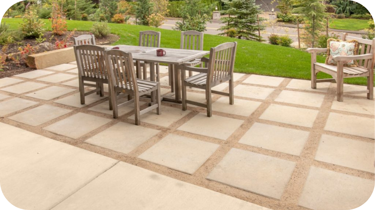
Premium Stone Pavers in Point Cook for Outdoor Designs
A well-designed outdoor space begins with the right foundation, and nothing sets the tone like natural stone pavers. At Splendour in Stone, we bring timeless
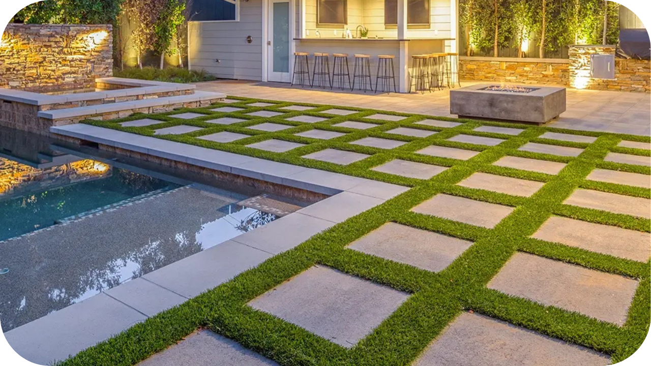
Paving Stones in Craigieburn for Patios and Walkways
Creating the perfect outdoor space starts with the right foundation. In Craigieburn, homeowners are turning to natural stone paving to enhance their patios and walkways
